Pierce

I collaborated on this project with a partner. My role was primarily on the technical aspects, like the Revit model, while my partner concentrated on developing a mood board and sourcing materials.
Many healthcare spaces, and especially waiting rooms, do not include much, if any, color and branding. My teammate and I noticed this when looking into Trinity Health. We also noticed that they had great branding and colors, those being green and purple, which were not being applied to the spaces we observed at all. People can spend hours in a hospital waiting room, and a sterile environment can cause stress, especially on top of already stressful situations.
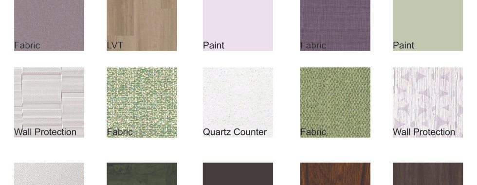
Here is our project, beginning with our research on the Trinity Health system. We created a color palette featuring muted versions of the Trinity Health logo colors, along with some neutral tones. We muted their colors as they were very vibrant and not suitable for use on furniture or walls. We believed this approach would integrate their identity without making the space feel overwhelming.


Next, we presented our mood board and precedent. The mood board was designed to reflect the Catholic values of Trinity Health, which are evident in our research above. We then incorporated existing healthcare reception spaces that exemplify the values observed in Trinity Health and aimed to integrate into the project.


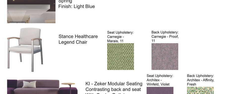
The next section covers materials and FF&E specifications. The materials were selected to align with the color palette and are all environmentally friendly in various ways. Primarily my partner, with my input, started finding materials and FF&E (furniture, fixtures, and equipment).
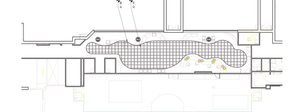
Next in line are the Furniture plan, Zoning diagram, Reflected Ceiling plan, and Elevations.
Then, using AutoCAD and Adobe Illustrator, we created a block diagram to help us know where everything would roughly go in the space. This was later revised once the final floor plan was finished to help people navigate it, using that final floor plan from Revit and Adobe Illustrator.
After that, I moved into Revit to work on modeling out the space.
We divided the workload like this because I was better with the more technical aspects, and my partner was good at finding good materials and furniture.


Finally, the renders.
We created a space that allowed those at the reception desk to have visibility of basically the whole area, which is very important in a hospital and other healthcare environments. We also wanted to use a lot of curves and more organic shapes. This can be seen in the flooring, ceiling, lights, and many of the furniture pieces. The acoustic part of the ceiling was originally brown but was changed to blue to reflect the appearance of sky or water. The couch formations were originally in straight lines, but were changed to be in curved sections to create more visual interest, more separate areas for people to sit, and add more organic shapes in the space.

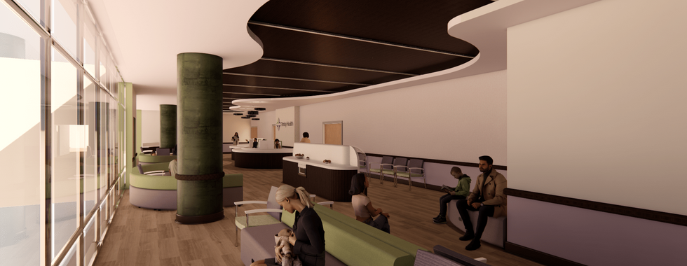


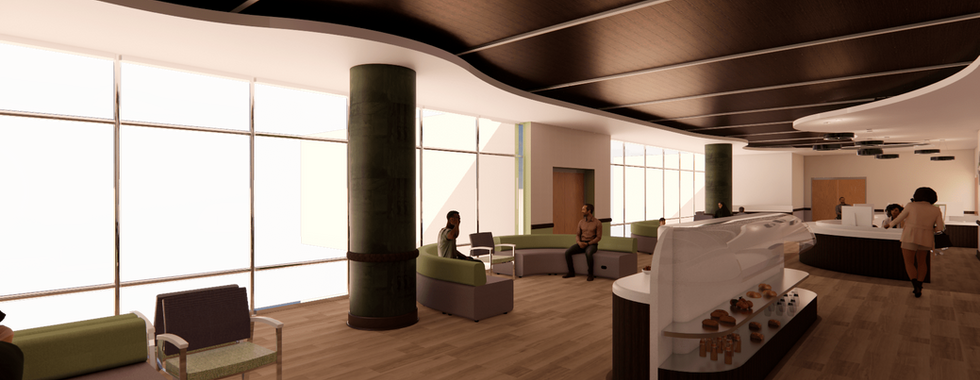


The result was a waiting room that allowed for many seating areas, a play area for any children that might be present, check-in kiosks, and a small grab-and-go food station that are all visible from the reception desk. This space includes Trinity Health’s colors and branding in a way that is not intrusive or overpowering.
I learned more about what working in a team on a design project is like. I also learned some things about how Revit can be used to create things. I also learned a lot about Enscape through this project.